Block
Allows to combine several sense-connected items. It's identical to fieldset but doesn't have label and frame.

Attributes
- className - (string) the user-defined css class for block's items
- disabled - (boolean) disables/enables the block's items
- hidden - (boolean) hides/shows the item. The default value - false (the item is shown)
- inputLeft - (integer) sets the left absolute offset of input.Just position:“absolute” makes sense of the attribute
- inputTop - (integer) sets the top absolute offset of input. Just position:“absolute” makes sense of the attribute
- list - defines the array of nested elements
- offsetLeft - (integer) sets the left relative offset of item
- offsetTop - (integer) sets the top relative offset of item
- position - (label-left, label-right, label-top or absolute) defines the position of label relative to block. As just labels are defined for block, just value absolute has sense and is used for setting absolute label position
- width - (integer) the width of block
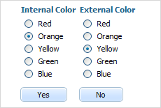
formData = [
	{type: "settings", position: "label-right"},
	{type: "block", width: 900, list:[
			{type: "label", label: "Internal Color"},
			{type: "radio", name: "n1", value: 1, label: "Red"},
			{type: "radio", name: "n1", value: 2, label: "Orange"},
			{type: "radio", name: "n1", value: 3, label: "Yellow"},
			{type: "radio", name: "n1", value: 4, label: "Green"},
			{type: "radio", name: "n1", value: 5, label: "Blue"},
			{type: "button", value: "Yes"},
			{type: "newcolumn"},
			{type: "label", label: "External Color"},
			{type: "radio", name: "n2", value: 1, label: "Red"},
			{type: "radio", name: "n2", value: 2, label: "Orange"},
			{type: "radio", name: "n2", value: 3, label: "Yellow"},
			{type: "radio", name: "n2", value: 4, label: "Green"},
			{type: "radio", name: "n2", value: 5, label: "Blue"},
			{type: "button", value: "No"}
	]}
];