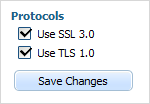
button
Presents a standard button.

Attributes
- className - (string) a user-defined css class for an item
- disabled - (boolean) disables/enables the item
- hidden - (boolean) hides/shows the item. The default value - false (the item is shown)
- inputLeft - (integer) sets the left absolute offset of control.Just position:“absolute” makes sense of the attribute
- inputTop - (integer) sets the top absolute offset of control. Just position:“absolute” makes sense of the attribute
- name - (string) the identification name. Used for referring to item
- offsetLeft - (integer) sets the left relative offset of item
- offsetTop - (integer) sets the top relative offset of item
- position - (label-left, label-right, label-top or absolute) defines the position of label relative to button. As labels are not defined for button, just the value absolute has sense and is used for setting absolute control position
- tooltip - (string) creates the tooltip for the control label
- value - (string) the text label of button
- width - (integer) the button's width
- userdata - (object) sets some user data for the control (key:value pairs)
var formData = [
                {type: "label", label: "Protocols"},
                {type: "checkbox", name: "ssl", label: "Use SSL 3.0", checked:true},
		{type: "checkbox", name: "tls", label: "Use TLS 1.0", checked:true},
		{type: "button", name: "btn", value: "Save Changes"}
];