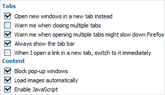
Checkbox
Presents a standard check box.

Attributes
- checked - (boolean) defines whether or not checkbox will be checked initially. The default value is false
- className - (string) the user-defined css class for item
- disabled - (boolean) disables/enables the item
- hidden - (boolean) hides/shows the item. The default value - false (the item is shown)
- info - (boolean) adds the
 icon after the input label (related event - onInfo)
 - inputLeft - (integer) sets the left absolute offset of input.Just position:“absolute” makes sense of the attribute
- inputTop - (integer) sets the top absolute offset of input. Just position:“absolute” makes sense of the attribute
- label - (string) the text label of item
- labelAlign - (left, right or center) the alignment of label within the defined width
- labelHeight - (integer or auto) the height of DIV where the label is placed (not the font size). The default value is auto
- labelLeft - (integer) sets the left absolute offset of label. Just position:“absolute” makes sense of the attribute
- labelTop - (integer) sets the top absolute offset of label. Just position:“absolute” makes sense of the attribute
- labelWidth - (integer or auto) the width of label. The default value is auto
- list - defines the array of nested elements
- name - (string) the identification name. Used for referring to item
- note - (object) creates the details block which is placed under the input
- text - (string) the text of the block
- width - (integer) the width of the block
- offsetLeft - (integer) sets the left relative offset of item (both input and label)
- offsetTop - (integer) sets the top relative offset of item (both input and label)
- position - (label-left, label-right, label-top or absolute) defines the position of label relative to check box
- required - (boolean) adds the
 icon after the label marking the input as mandatory. Also, setting the attribute to true automatically assignes the 'NotEmpty' validation rule to the input
 - readonly -(boolean:true/false or 0/1) specifies whether item's value can be changed by button click in browser (meanwhile, item's value can be changed programmatically anytime)
- tooltip - (string) creates the tooltip for the input label
- value - (string) the initial value of item
- userdata - (object) sets some user data for the input (key:value pairs)
var formData = [
		{type: "label", label: "Tabs"},
		{type: "checkbox", name: "ch", label: "Open new windows in a new tab instead", checked: true},
		{type: "checkbox", label: "Warn me when closing multiple tabs"},
		{type: "checkbox", label: "Warn me when opening multiple tabs might slow down Firefox", checked: true},
		{type: "checkbox", label: "Always show the tab bar", checked: true},
		{type: "checkbox", label: "When I open a link in a new tab, switch to it immediately"},
		//
		{type: "label", label: "Content"},
		{type: "checkbox", label: "Block pop-up windows", checked: true},
		{type: "checkbox", label: "Load images automatically", checked: true},
		{type: "checkbox", label: "Enable JavaScript", checked: true}
];