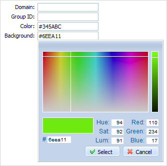
colorpicker
dhtmlxColorPicker integration. A data field with pop-up colorPicker.

Please note, to use colorpicker item you must include several dhtmlxColorPicker related files:
1.If you use dhtmlxColorPicker standalone you need to include 3 files:
<script src="../codebase/dhtmlxcolorpicker.js"></script>
<link rel="stylesheet" type="text/css" href="../codebase/dhtmlxcolorpicker.css">
<script src="../codebase/ext/dhtmlxform_item_dhxcolorpicker.js"></script>
2.If you use dhtmlxColorPicker as a part of 'dhtmlxSuite' package you need to include 2 files:
<link rel="STYLESHEET" type="text/css" href="../codebase/dhtmlx.css">
<script src="../codebase/dhtmlx.js" type="text/javascript"></script>
Using dhtmlxColorpicker API
To use the dhtmlxColorpicker API for the item, get the colorpicker object as in:
var dhxColorPicker = myForm.getColorPicker("myPicker");
...
dhxColorPicker.hide();
Attributes
- className - (string) the user-defined css class for item
- disabled - (boolean) disables/enables the item
- hidden - (boolean) hides/shows the item. The default value - false (the item is shown)
- info - (boolean) adds the
 icon after the input label (related event - onInfo)
 - imagePath - (url) the relative path to colorPicker's images (dhtmlxColorPicker/codebase/imgs/)
- inputHeight - (integer or auto) sets input height. The default value is auto
- inputLeft - (integer) the left absolute offset of input. Just position:“absolute” makes sense of the attribute
- inputTop - (integer) the top absolute offset of input. Just position:“absolute” makes sense of the attribute
- inputWidth - (integer or auto) sets input width. The default value is auto
- label - (string) the text label of item
- labelAlign - (left, right or center) the alignment of label within the defined width
- labelHeight - (integer or auto) the height of label. The default value is auto
- labelLeft - (integer) the left absolute offset of label. Just position:“absolute” makes sense of the attribute
- labelTop - (integer) the top absolute offset of label. Just position:“absolute” makes sense of the attribute
- labelWidth - (integer or auto) the width of label. The default value is auto
- name - (string) the identification name. Used for referring to item
- note - (object) creates the details block which is placed under the input
- text - (string) the text of the block
- width - (integer) the width of the block
- offsetLeft - (integer) sets the left relative offset of item (both input and label)
- offsetTop - (integer) sets the top relative offset of item (both input and label)
- position - (label-left, label-right, label-top or absolute) defines the position of label relative to input
- readonly -(boolean:true/false or 0/1) specifies whether item's value can be changed by typing in the input (you are still able to set the value by clicking on the colorpicker icon). Can be used to exclude the possibility of entering incorrect values
- required - (boolean) adds the
 icon after the label marking the input as mandatory. Also, setting the attribute to true automatically assignes the 'NotEmpty' validation rule to the input
 - tooltip - (string) creates the tooltip for the input label
- validate - (predefined rule or custom function) sets the validation rule. See details in the chapter 'Validation'
- value - (string) the initial value of item
- userdata - (object) sets some user data for the input (key:value pairs)
var formData = [
		{type: "settings", labelAlign:'right', labelWidth: 70},
		{type: 'input', name: 'Domain', id:'Domain', label: 'Domain:'},
		{type: 'input', name: 'GroupID', id:'GroupID', label: 'Group ID:'},
		{type: 'colorpicker', name: 'Color', label: 'Color:', value:"#345ABC", imagePath: "../dhtmlxColorPicker/codebase/imgs/"},
		{type: 'colorpicker', name: 'Background', label: 'Background:', value:"#6EEA11", imagePath: "../dhtmlxColorPicker/codebase/imgs/"}
];