Validation
Enabling validation
- To enable validation you need to specify property validate and set it to the desired rule.
var formData = [{type: "input", name:"username", label: "User Name", validate: "NotEmpty"}];
var dhxForm = new dhtmlXForm("dhxFormObj", formData);
- You can specify several validation rules at once, by separating them with comma.
var formData = [{type: "input", name:"dateOfbirth", label: "Date of Birth", validate:"NotEmpty,ValidNumeric"}];
var dhxForm = new dhtmlXForm("dhxFormObj", formData);
With such markup, each time when you call methods save() and send(), validation will fire.
You can also force form validation using the validate() method:
var formData = [{type: "input", name:"username", label: "User Name", validate: "NotEmpty"},
         	{type: "button", name: "btn", value: "validate"}];];
var myForm = new dhtmlXForm("form_container", formData);

myForm.attachEvent("onButtonClick", function(id) { myForm.validate(); } );
Live validation
dhtmlxForm provides support for the Live Validation mode - a mode when validation is invoked just after an input goes out of focus (in the standard mode validation is invoked when the user clicks the submit button).
To enable the Live Validation mode, you should call the enableLiveValidation() method with the true parameter.
myForm.enableLiveValidation(true);
Required fields
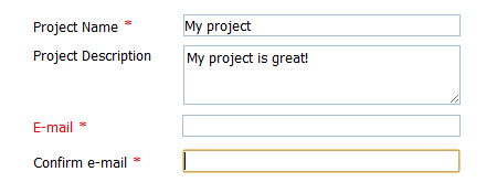
The library provides an easy way to treat the required fields - attribute required. Setting the attribute for an input will add the ![]() icon after its label and assign the 'NotEmpty' validation rule to it.
icon after its label and assign the 'NotEmpty' validation rule to it.

BTW, you can add any additional validation rule(s) to the required fields. For example, for the 'E-mail'/'Confirm e-mail' fields (in the image above) you can set the ValidEmail rule (in addition to NotEmpty ) to check whether the input value is correct, i.e. the form will check whether the field contains any value and if it does, check whether this value has the correct format.
formData = [
	{type: "input", name: "prj_name", label: "Project Name", value: "My Project", required: true},
	{type: "input", name: "prj_descr", label: "Project Description", value: "My project is great!", rows: 3},
	{type: "input", name: "email", label: "E-mail", value: "", validate: "ValidEmail", required: true},
	{type: "input", name: "email2", label: "Confirm e-mail", validate: "ValidEmail", value: "", required: true}
];
In the image above validation failed for the Email field.
Note, there is a special method that will allow you to make/unmake a certain field required - setRequired().
myForm.setRequired("prj_name",true); //makes the input with the name 'prj_name' required
...
myForm.setRequired("name",false); //makes the input with the name 'prj_name' unrequired
Marking validation errors
When input fails validation it's marked with 'dhtmlx_validation_error' css class. So if you want to define custom styling you need to set those rule:
.dhtmlx_validation_error{
      ... any custom marking rules here ...
}
The custom messages can be added by using validation events.
Validation events
There are 4 validation events:
- onBeforeValidate - starts before validation and allows to prepare input data to it (blockable)
- onValidateSuccess - fires if validation check for some field is positive
- onValidateError - fires if validation check for some field is negative
- onAfterValidate - fires after validation, provides result of total validation
You can also handle HTML input-related events, such as onblur (fires when the element which is in focus, loses that focus). For mode details, read article 'Events handling', chapter 'Triggering HTML events'.
Validation rules
There are 3 types of rules:
- Standard rules;
- Custom rules;
- Regural expressions.
Standard rules
Standard rules are the next:
- Empty;
- NotEmpty;
- ValidBoolean;
- ValidEmail;
- ValidInteger;
- ValidNumeric;
- ValidAplhaNumeric;
- ValidDatetime;
- ValidDate;
- ValidTime;
- ValidIPv4;
- ValidCurrency;
- ValidSSN;
- ValidSIN.
var formData = [{type: "input", label: "Number", validate:"ValidEmail"}];
Custom rules
Custom rules can be created by defining a custom function and using its name as the validation rule. Such function takes the only parameter - the field's value and if validation is successful returns true, otherwise false.
var formData = [{type: "input", label: "Number", validate:"Greater100"}];
...
function Greater100(data){
        return (data>100);
}
In case, you want to validate a field just if it contains something (i.e. don't validate the field if it's empty), you should use the following technique:
var formData = [{type: "input", label: "Number", validate:"Greater100"}];
...
function Greater100(data){
        if (data=="") return true;// returns 'true' if the field is empty

        return (data>100);
}
Regular expressions
You can use a regural expression as value of validate attribute:
var formData = [{type: "input", label: "Number", validate:"[0-9]+"}];
Assigning validation rules dynamically
There are 2 methods that let you to set/remove validation rules dynamically. They are:
- setValidation() - adds a validation rule to the input with the specified name;
- clearValidation() - removes all validation rules from the input.
myForm.setValidation('age', 'ValidInteger');
...
myForm.clearValidation('age');