Table of Contents
btn2state
presents a customizable checkbox.

To use the control you must include one extra file dhtmlxform_item_btn2state.js:
<script src="../../codebase/ext/dhtmlxform_item_btn2state.js"></script>
Attributes
- checked - (boolean) defines whether or not checkbox will be checked initially. The default value is false
- className - (string) the user-defined css class for item
- cssName - (string) allows setting individual look for a specific item's instance (see details below)
- disabled - (boolean) disables/enables the item
- hidden - (boolean) hides/shows the item. The default value - false (the item is shown)
- info - (boolean) adds the
 icon after the input label (related event - onInfo)
 - inputLeft - (integer) sets the left absolute offset of input.Just position:“absolute” makes sense of the attribute
- inputTop - (integer) sets the top absolute offset of input. Just position:“absolute” makes sense of the attribute
- label - (string) the text label of the item
- labelAlign - (left, right or center) the alignment of label within the defined width
- labelHeight - (integer or auto) the height of DIV where the label is placed (not the font size). The default value is auto
- labelLeft - (integer) sets the left absolute offset of label. Just position:“absolute” makes sense of the attribute
- labelTop - (integer) sets the top absolute offset of label. Just position:“absolute” makes sense of the attribute
- labelWidth - (integer or auto) the width of label. The default value is auto
- list - defines the array of nested elements
- name - (string) the identification name. Used for referring to item
- note - (object) creates the details block which is placed under the input
- text - (string) the text of the block
- width - (integer) the width of the block
- offsetLeft - (integer) sets the left relative offset of item (both input and label)
- offsetTop - (integer) sets the top relative offset of item (both input and label)
- position - (label-left, label-right, label-top or absolute) defines the position of label relative to check box
- required - (boolean) adds the
 icon after the label marking the input as mandatory. Also, setting the attribute to true automatically assignes the 'NotEmpty' validation rule to the input
 - readonly -(boolean:true/false or 0/1) specifies whether item's value can be changed by button click in browser (meanwhile, item's value can be changed programmatically anytime)
- tooltip - (string) creates the tooltip for the input label
- value - (string) the initial value of item
- userdata - (object) sets some user data for the input (key:value pairs)
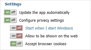
var formData = [
    {type: "label", label: "Settings"},
    {type: "btn2state", label: "Update the app automatically", checked: true, info:true, required:true},
    {type: "btn2state", label: "Configure privacy settings", list:[
         {type: "btn2state", label: "Start when I start Windows"},
         {type: "btn2state", label: "Allow to be shown on the web"},
	 {type: "btn2state", label: "Accept browser cookies", checked: true}
    ]}
];
Details
The control behave itself as a checkbox but doesn't have any visual representation ( i.e. if you simply add it to the page the page will display nothing (it just adds an empty DIV).
To form the look of the control you should specify 4 css classes with the following names (the css classes will be applied to all controls of type bt2state):
- .dhxform_obj_dhx_skyblue div.dhxform_img.btn2state_0 - applied when the item is enabled and not checked
- .dhxform_obj_dhx_skyblue div.dhxform_img.btn2state_1 - applied when the item is enabled and checked
- .dhxform_obj_dhx_skyblue div.disabled div.dhxform_img.btn2state_0 - applied when the item is disabled and not checked
- .dhxform_obj_dhx_skyblue div.disabled div.dhxform_img.btn2state_1 - applied when the item is disabled and checked
.dhxform_obj_dhx_skyblue div.dhxform_img.btn2state_0 {
	background-image: url("imgs/toggle_off.png");
	width: 42px;
	height: 20px;
};
.dhxform_obj_dhx_skyblue div.dhxform_img.btn2state_1 {
	background-image: url("imgs/toggle_on.png");
	width: 42px;
	height: 20px;
};
.dhxform_obj_dhx_skyblue div.disabled div.dhxform_img.btn2state_0 {
	background-image: url("imgs/toggle_off_dis.png");
	width: 42px;
	height: 20px;
}
.dhxform_obj_dhx_skyblue div.disabled div.dhxform_img.btn2state_1 {
	background-image: url("imgs/toggle_on_dis.png");
	width: 42px;
	height: 20px;
}

formData = [
	{type: "btn2state", label: "Update the app automatically", checked: true},
        ...
]
To set the look of just a specific bt2state instance you should use the cssName attribute.
In this case, css classes must have the following names:
- .dhxform_obj_dhx_skyblue div.dhxform_img.[cssName]_0
- .dhxform_obj_dhx_skyblue div.dhxform_img.[cssName]_1
- .dhxform_obj_dhx_skyblue div.disabled div.dhxform_img.[cssName]_0
- .dhxform_obj_dhx_skyblue div.disabled div.dhxform_img.[cssName]_1